
Countless homeowners dedicate hours to selecting their primary exterior shade — yet rush through decisions about borders and details in mere minutes. This explains why so many finished projects fail to impress. Your dominant hue represents just one piece of a three-part puzzle. The way you coordinate secondary and tertiary elements ultimately determines whether your home appears professionally designed or hastily assembled. At Mighty Dog Roofing, we guide homeowners through this decision with expert precision.
Understanding the Three-Color System
Body, Trim, and Accent — What Each One Does
The primary shade establishes your home's visual identity and communicates its overall character to passersby. Border elements frame windows, define corners, and guide observers' eyes along architectural features. Feature elements — including doors, shutters, and decorative details — inject personality while creating visual depth. Understanding these distinct roles proves essential when creating siding color combinations Chester County residents will appreciate for decades.
Why the Ratio Matters as Much as the Colors
Design professionals rely on the 60-30-10 principle: dominant shades occupy 60% of visual space, borders claim 30%, and feature elements complete the remaining 10%. When border shades too closely match the primary hue, architectural definition vanishes and surfaces appear to merge. On the opposite end, excessive feature elements generate distracting visual competition. This exterior color scheme Pennsylvania approach maintains compositional harmony and deliberate design intent.
How to Choose Your Body Color First
What to Factor In Before Picking a Color
Your roofing material presents an unchangeable starting point that demands coordination rather than conflict. Neighborhood aesthetics also influence perception — a striking standalone choice may appear discordant within your specific streetscape. Undertone complexity adds another layer of consideration; two shades both marketed as "gray" can clash dramatically when one carries blue undertones while another skews green.
Essential considerations for your primary shade:
- Current roofing material and its underlying tones
- Surrounding properties and natural landscape elements
- Your home's architectural heritage and style
- How sunlight interacts with main exterior walls
Our specialists assess each of these variables during every siding replacement in Chester County consultation before suggesting a direction for your project.
Colors That Give You the Most Trim and Accent Flexibility
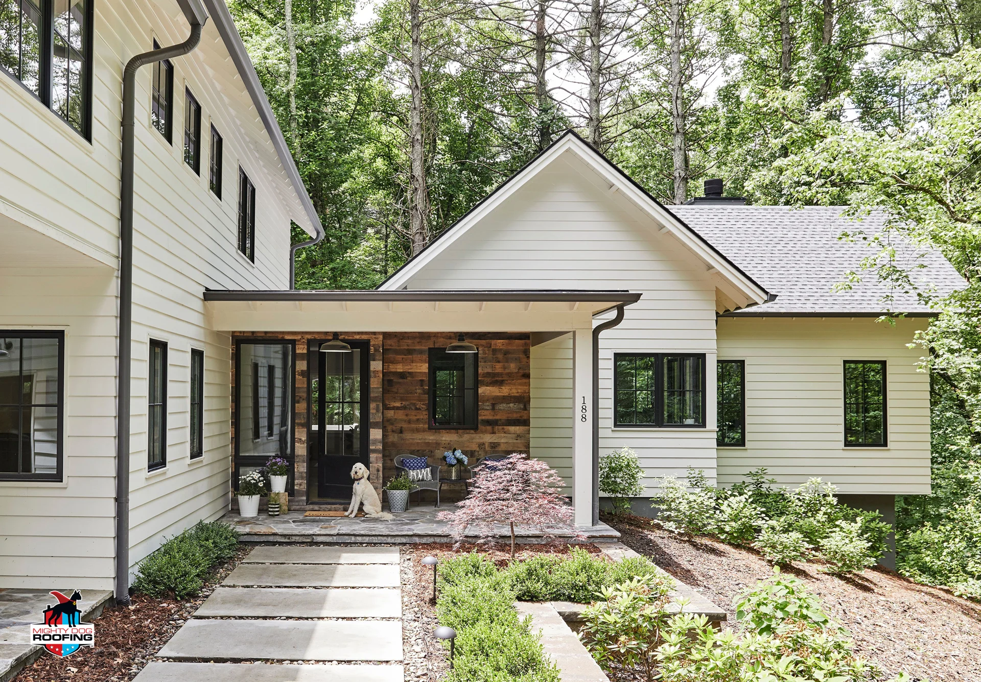
Warm neutrals — including taupe, greige, and muted clay — deliver maximum versatility since they harmonize effortlessly with both warm and cool secondary options. Deep foundational choices like navy, forest green, or charcoal create striking impressions but necessitate more restrained supporting palettes. Lighter foundations such as cream or soft gray require thoughtful pairing to prevent a washed-out or lifeless appearance.
Pairing Trim — Contrast vs Harmony
High-Contrast Trim Pairings
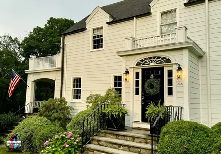
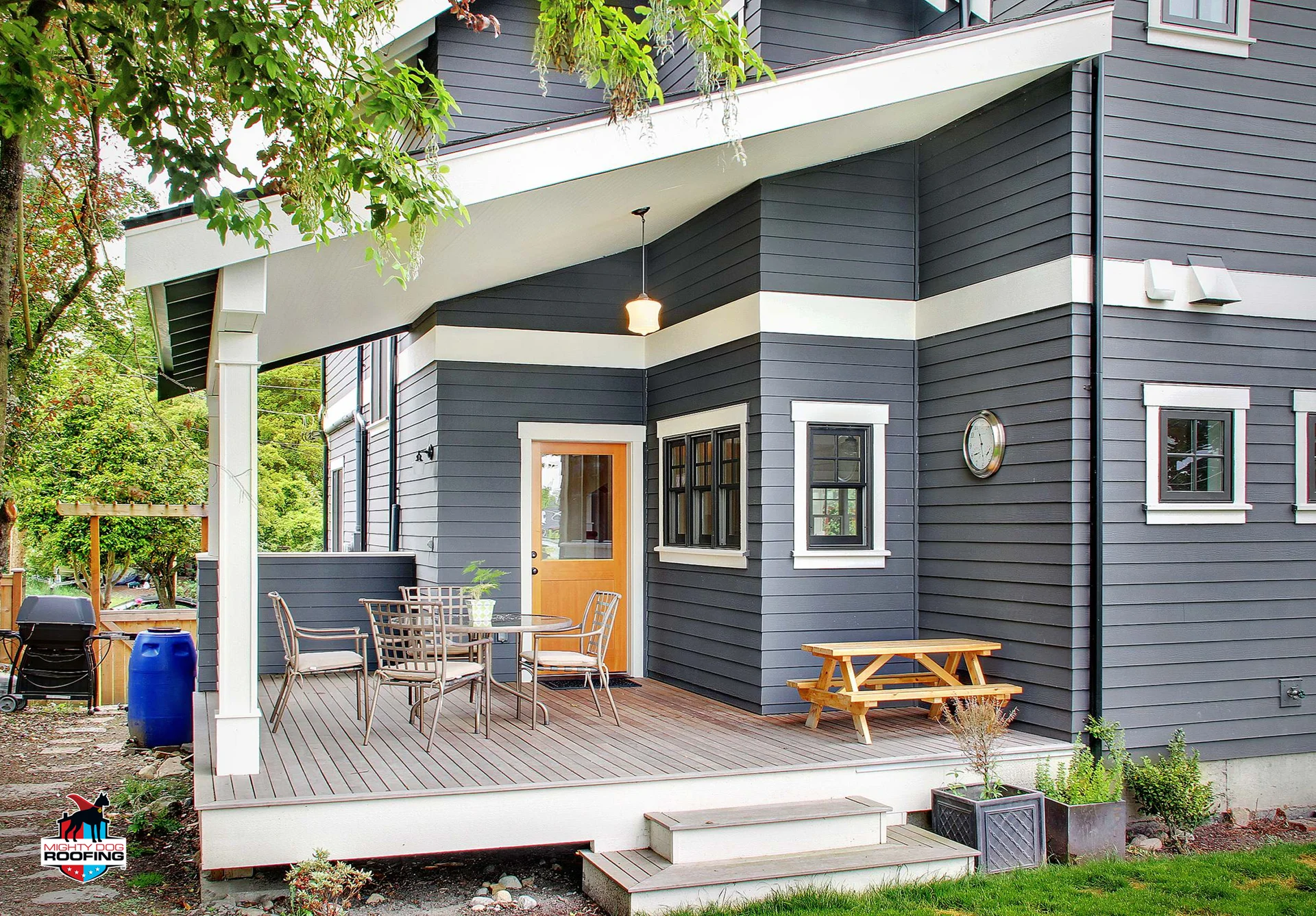
Crisp white borders against darker primary shades remain timeless, elegant, and universally flattering across diverse architectural traditions. Black borders paired with lighter foundations deliver contemporary sophistication with razor-sharp definition that photographs exceptionally well. That said, high-contrast approaches suit homes featuring pronounced architectural geometry; on simpler structures, such stark differentiation may compete with rather than enhance existing proportions. Your body trim accent colors exterior selections should honor your home's inherent architectural character.
Tonal and Harmonious Trim Pairings
Selecting borders just one or two gradations lighter or darker than your primary shade produces understated elegance without overwhelming visual impact. These graduated pairings allow architectural nuances to emerge gracefully rather than demanding attention. Undertone consistency becomes paramount here — pairing cool gray with warm cream creates jarring discord even when light-dark values technically align. Maintaining undertone harmony ensures cohesive results.
Accent Colors — Where Personality Lives
How to Choose an Accent That Completes the Palette
Your feature shade must establish meaningful distinction from both primary and border elements; without adequate differentiation, it simply disappears. The spectrum offers two proven approaches: complementary selections (opposing positions) generate dynamic visual tension, while analogous selections (neighboring positions) foster gentle cohesion.
Evaluating whether your feature shade succeeds:
- Position yourself 30 feet away and narrow your eyes — does the entry door command attention?
- Capture images under both direct sunlight and shaded conditions
- Evaluate your preferred option alongside at least three alternatives before finalizing
A siding color pairing guide offers valuable starting points, though on-site evaluation ultimately confirms whether your selection appears purposeful or arbitrary.
Popular Accent Strategies in 2025–2026
Rich burgundy and deep navy entry doors against neutral exteriors continue gaining momentum, reflecting curb appeal color tips that prioritize enduring sophistication. Matte black hardware and shutters function as cohesive anchoring elements that unify disparate design components. Natural wood tones — whether genuine timber or composite alternatives — introduce warmth against cooler-toned panels, producing an inviting juxtaposition that feels simultaneously contemporary and welcoming.
Common Pairing Mistakes and How to Avoid Them
Mistakes That Flatten the Exterior
When borders approach the primary shade too closely, edges dissolve and architectural character becomes invisible from the street. Feature elements matching the dominant hue completely undermine their intended purpose. Most frequently, homeowners overlook their roofing — the single element capable of either unifying the entire composition or fragmenting it completely.
Indicators that your palette lacks dimension:
- Window frames and corner details disappear visually
- Entry doors merge indistinguishably into adjacent surfaces
- Roofing competes against wall surfaces instead of complementing them
Partnering with a residential siding contractor helps identify these pitfalls before installation materials reach your property.
Mistakes That Overwhelm the Exterior
Multiple feature shades battling for dominance fracture visual coherence and exhaust the observer's eye. Fashionable primary selections paired with outdated border choices produce awkward aesthetic misalignment that ages rapidly. Combining warm and cool tones without a mediating neutral abandons the exterior to visual disorder. Measured restraint frequently achieves more refined outcomes than ambitious experimentation. Mighty Dog Roofing routinely counsels Chadds Ford homeowners to streamline initial concepts for maximum visual impact.
Testing Your Combination Before You Commit
How to Sample All Three Colors Together
Small swatches held in your palm reveal almost nothing about how shades will interact across an actual exterior surface. You require substantial samples — minimum 12×12 inches — displaying all three selections viewed simultaneously outdoors. Examine your combination under morning illumination and revisit during afternoon hours because perceptions shift substantially throughout the day. Digital rendering applications serve as helpful preliminary resources, though they should never constitute your definitive decision-making authority.
Getting a Professional Opinion
A siding installer near you assesses variables that digital applications cannot replicate: how established plantings influence perception, how shadows traverse your facade throughout the day, and how adjacent Pennsylvania properties affect what reads harmoniously. Material finish characteristics matter considerably as well — matte textures interact with light differently than satin surfaces, altering how selections appear from dawn until dusk. Contact Mighty Dog Roofing for a complimentary estimate and professional guidance on your exterior renovation project.
When Body, Trim, and Accent Work Together, It Shows
An exceptional exterior palette emerges from systematic planning rather than fortunate guessing. When all three elements function cohesively within appropriate proportions, the entire residence projects intentional sophistication from every vantage point. Mighty Dog Roofing brings professional expertise throughout every project, ensuring your investment achieves the striking curb appeal you envision.